Catching Up & Happy Birthday#
First of all, let me say I’m sorry for missing last week’s tutorial. There is no excuse:

Exploratory Data Analysis (EDA)#
Our main goal while doing EDA is to summarize main characteristics of our dataset.
It’s crucial that we understand what our data is composed of.
First, we take a look.#
"""
configuration.py

Constants defined for data retrieval and preprocessing.
"""

# GitHub data directory URL.
DATA_DIRECTORY = (
    "https://raw.githubusercontent.com/mdcollab/covidclinicaldata/master/data/"
)

# Pattern for composing CSV file URLS to read.
CSV_FILE_PATTERN = "{week_id}_carbonhealth_and_braidhealth.csv"
CSV_URL_PATTERN = f"{DATA_DIRECTORY}/{CSV_FILE_PATTERN}"

# *week_id*s used to format CSV_FILE_PATTERN with.
WEEK_IDS = (
    "04-07",
    "04-14",
    "04-21",
    "04-28",
    "05-05",
    "05-12",
    "05-19",
    "05-26",
    "06-02",
    "06-09",
    "06-16",
    "06-23",
    "06-30",
    "07-07",
    "07-14",
    "07-21",
    "07-28",
    "08-04",
    "08-11",
    "08-18",
    "08-25",
    "09-01",
    "09-08",
    "09-15",
    "09-22",
    "09-29",
    "10-06",
    "10-13",
    "10-20",
)

# Values replacement dictionary by column name.
REPLACE_DICT = {"covid19_test_results": {"Positive": True, "Negative": False}}

# Name of the column containing the COVID-19 test results.
TARGET_COLUMN_NAME = "covid19_test_results"

# Fractional threshold of missing values in a feature.
NAN_FRACTION_THRESHOLD = 0.5

# Prefix used in columns containing X-ray data results.
X_RAY_COLUMN_PREFIX = "cxr_"
| test_name | swab_type | covid19_test_results | age | high_risk_exposure_occupation | high_risk_interactions | diabetes | chd | htn | cancer | asthma | copd | autoimmune_dis | smoker | temperature | pulse | sys | dia | rr | sats | rapid_flu_results | rapid_strep_results | ctab | labored_respiration | rhonchi | wheezes | days_since_symptom_onset | cough | cough_severity | fever | sob | sob_severity | diarrhea | fatigue | headache | loss_of_smell | loss_of_taste | runny_nose | muscle_sore | sore_throat | er_referral | |
|---|---|---|---|---|---|---|---|---|---|---|---|---|---|---|---|---|---|---|---|---|---|---|---|---|---|---|---|---|---|---|---|---|---|---|---|---|---|---|---|---|---|
| 0 | SARS COV 2 RNA RTPCR | Nasopharyngeal | False | 58 | True | nan | False | False | False | False | False | False | False | False | 36.950000 | 81.000000 | 126.000000 | 82.000000 | 18.000000 | 97.000000 | nan | nan | False | False | False | False | 28.000000 | True | Severe | nan | False | nan | False | False | False | False | False | False | False | False | False |
| 1 | SARS-CoV-2, NAA | Oropharyngeal | False | 35 | False | nan | False | False | False | False | False | False | False | False | 36.750000 | 77.000000 | 131.000000 | 86.000000 | 16.000000 | 98.000000 | nan | nan | False | False | False | False | nan | True | Mild | False | False | nan | False | False | False | False | False | False | False | False | False |
| 2 | SARS CoV w/CoV 2 RNA | Oropharyngeal | False | 12 | nan | nan | False | False | False | False | False | False | False | False | 36.950000 | 74.000000 | 122.000000 | 73.000000 | 17.000000 | 98.000000 | nan | nan | nan | nan | nan | nan | nan | False | nan | nan | nan | nan | nan | nan | nan | nan | nan | nan | nan | nan | False |
| 23498 | SARS-CoV-2, NAA | Nasal | False | 35 | False | False | False | False | False | False | False | False | False | False | 37.000000 | 69.000000 | 136.000000 | 84.000000 | 12.000000 | 100.000000 | nan | nan | False | nan | nan | nan | nan | False | nan | False | False | nan | False | False | False | False | False | False | False | False | nan |
| 23499 | SARS-CoV-2, NAA | Nasal | False | 24 | False | True | False | False | False | False | False | False | False | False | 36.750000 | 70.000000 | 128.000000 | 78.000000 | 12.000000 | 99.000000 | nan | nan | nan | False | False | False | nan | False | nan | False | False | nan | False | False | False | False | False | False | False | False | nan |
| 23500 | SARS-CoV-2, NAA | Nasal | False | 52 | False | False | False | False | False | False | False | False | False | False | 37.000000 | 94.000000 | 165.000000 | 82.000000 | 12.000000 | 98.000000 | nan | nan | nan | False | False | False | 7.000000 | True | nan | False | False | nan | False | False | False | False | False | False | False | False | nan |
| 46996 | SARS-CoV-2, NAA | Nasal | False | 11 | False | False | False | False | False | False | False | False | False | False | 36.900000 | 78.000000 | 116.000000 | 79.000000 | 16.000000 | 100.000000 | nan | nan | True | False | True | True | nan | False | nan | False | False | nan | False | False | False | False | False | False | False | False | nan |
| 46997 | SARS-CoV-2, NAA | Nasal | False | 30 | False | False | False | False | False | False | False | False | False | False | nan | nan | nan | nan | nan | nan | nan | nan | nan | nan | nan | nan | nan | False | nan | False | False | nan | False | False | False | False | False | False | False | False | nan |
| 46998 | SARS-CoV-2, NAA | Nasal | False | 36 | False | False | False | False | False | False | False | False | False | False | 36.850000 | 81.000000 | 122.000000 | 81.000000 | 14.000000 | 100.000000 | nan | nan | nan | False | nan | nan | 7.000000 | True | Mild | False | True | Mild | True | True | True | False | False | False | True | False | nan |
| 70494 | Rapid COVID-19 PCR Test | Nasal | False | 32 | False | nan | False | False | False | False | False | False | False | False | nan | nan | nan | nan | nan | nan | nan | nan | nan | nan | nan | nan | nan | False | nan | nan | False | nan | False | False | False | False | False | False | False | False | nan |
| 70495 | SARS-CoV-2, NAA | Nasal | False | 59 | False | False | False | False | True | False | False | False | False | False | 36.600000 | 75.000000 | 137.000000 | 99.000000 | nan | 97.000000 | nan | nan | False | False | False | False | 7.000000 | True | Moderate | True | False | nan | False | False | False | False | False | False | False | True | nan |
| 70496 | SARS-CoV-2, NAA | Nasal | False | 27 | False | True | False | False | False | False | False | False | False | False | 37.000000 | 63.000000 | 113.000000 | 71.000000 | 15.000000 | 98.000000 | nan | nan | nan | False | nan | nan | 2.000000 | False | nan | False | False | nan | False | False | False | False | False | False | False | False | nan |
| 93992 | SARS-CoV-2, NAA | Nasal | False | 33 | False | nan | False | False | False | False | False | False | False | False | nan | nan | nan | nan | nan | nan | nan | nan | nan | nan | nan | nan | nan | False | nan | nan | False | nan | False | False | False | False | False | False | False | False | nan |
| 93993 | Rapid COVID-19 PCR Test | Nasal | False | 46 | False | False | False | False | False | False | False | False | False | False | nan | nan | nan | nan | nan | nan | nan | nan | nan | nan | nan | nan | nan | False | nan | False | False | nan | False | False | False | False | False | False | False | False | nan |
| 93994 | Rapid COVID-19 PCR Test | Nasal | False | 53 | False | nan | False | False | True | False | False | False | False | False | nan | nan | nan | nan | nan | nan | nan | nan | nan | nan | nan | nan | nan | False | nan | nan | False | nan | False | False | False | False | False | False | False | False | nan |
Alright! Some things that we can already learn about our dataset from this table are:
It contains a total of 93995 observations.
There are 41 columns with mixed data types (numeric and categorical).
Missing values certainly exist (we can easily spot
nanentries).The subsample raises a strong suspicion that dataset is imbalanced, i.e. when examining our target variable (‘covid19_test_results’) it seems there are far more negative observations than positive ones. A quick
sum()call reveals that indeed only 1313 of the 93995 observations are positive.
Missing Values
Handling missing values requires careful judgement. Possible solutions include:
Removing the entire feature (column) containing the missing values.
Removing all observations with missing values.
Imputation: “Filling in” missing values with some constant or statistic, such as the mean or the mode.
The approach we’ll take when dealing with missing values depends heavily on the structure of our data, for example:
If a column contains a small number of observations (relative to the size of the dataset) and the dataset is rich enough and offers more features that could be expected to be informative, it might be best to remove it.
If the dataset is large and the feature in question is crucial for the purposes of our analysis, remove all observations with missing values.
Imputation might sound like a good trade-off if there is a good reason to believe some statistic may adequately approximate the missing values, but it is also the subject of many misconceptions and often used poorly.
There are also ML methods that can safely include missing values (such as decision trees). We will learn when and how these are used later in this course.
data = clean_missing_values(data)
Once the dataset is clean of any missing values, we can go on to inspect the kind of features that are available for us.
X = data.drop(TARGET_COLUMN_NAME, axis=1)

categorial_features = X.select_dtypes(["object", "bool"])
numerical_featuers = X.select_dtypes(exclude=["object", "bool"])

print("Categorial features:\n" + ", ".join(categorial_features.columns))
print("\nNumerical features:\n" + ", ".join(numerical_featuers.columns))
Categorial features:
test_name, swab_type, high_risk_exposure_occupation, high_risk_interactions, diabetes, chd, htn, cancer, asthma, copd, autoimmune_dis, smoker, labored_respiration, cough, fever, sob, diarrhea, fatigue, headache, loss_of_smell, loss_of_taste, runny_nose, muscle_sore, sore_throat

Numerical features:
age, temperature, pulse, sats
We are left with 28 features and 37754 observations (718 of which are positive).
Visualization#
Simply looking at the values in our data isn’t enough. It’s helpful to visualize how different variables interact with each out, how the distribute, etc.
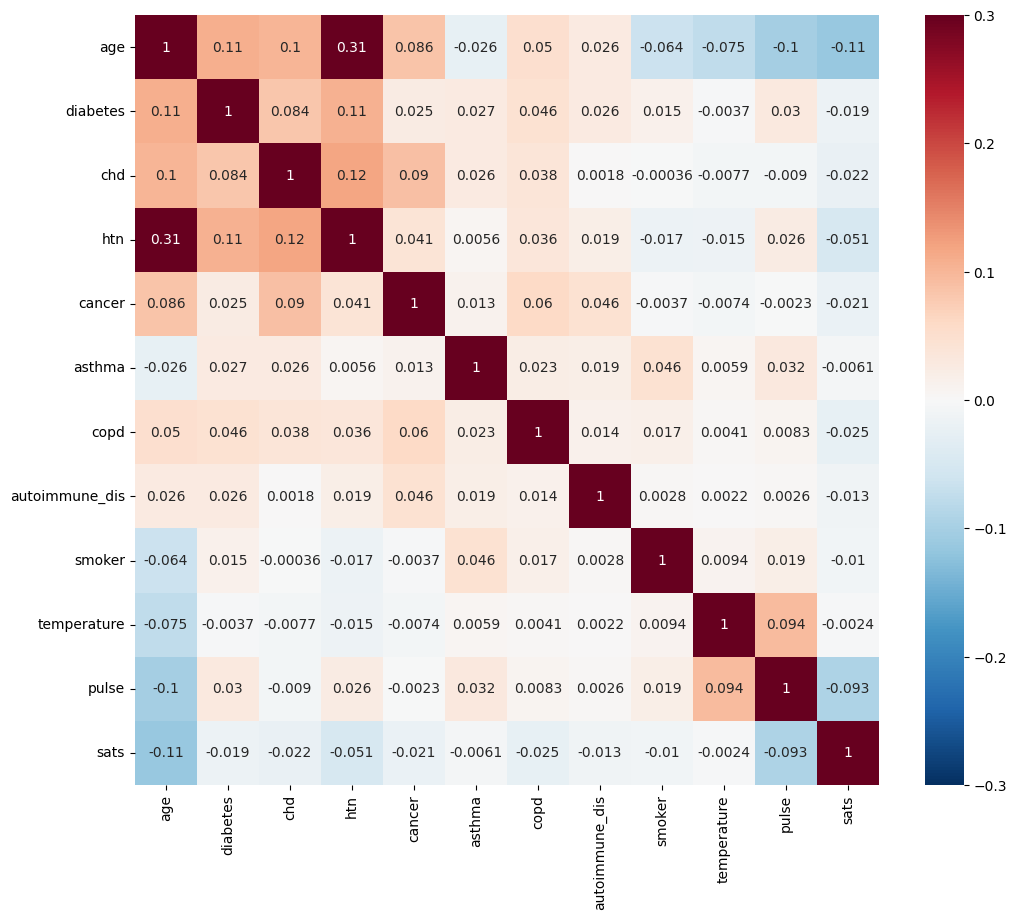
Feature Correlations#
import matplotlib.pyplot as plt
import seaborn as sns

correlation_matrix = X.corr(numeric_only=True)
fig, ax = plt.subplots(figsize=(12, 10))
_ = sns.heatmap(correlation_matrix, annot=True,vmin=-.3, vmax=.3, center=0, cmap="RdBu_r", ax=ax)
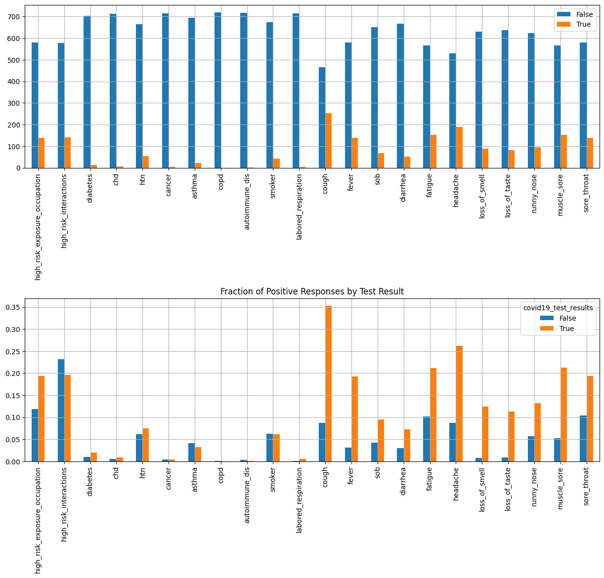
Categorial Features#
import pandas as pd
plt.rcParams['axes.grid'] = True

boolean_features = X.select_dtypes(["bool"])
positives = boolean_features[target]
value_counts = {}
for column in positives:
    value_counts[column] = positives[column].value_counts()
value_counts = pd.DataFrame(value_counts)

fig, axes = plt.subplots(2,1,figsize=(15, 12))
_ = value_counts.T.plot(kind="bar", ax=axes[0])
_ = plt.title("Symptoms in Positive Patients")
_ = ax.set_xlabel("Feature")
_ = ax.set_ylabel("Count")
plt.grid()

# Group all boolean features by the target variable (COVID-19 test result)
grouped = boolean_features.groupby(target)

# Calculate the fraction of positives in each group.
fractions = grouped.sum() / grouped.count()

_ = fractions.T.plot(kind="bar", ax=axes[1])
_ = plt.title("Fraction of Positive Responses by Test Result")
_ = ax.set_xlabel("Feature")
_ = ax.set_ylabel("Fraction")

plt.subplots_adjust(hspace=0.8)
Numerical Features#
# Select all numerical features.
numerical_features = X.select_dtypes(["float64", "int64"])

# Create distribution plots.
nrows = len(numerical_features.columns)
fig, ax = plt.subplots(nrows=nrows, ncols=2, figsize=(15, 30))
for i, feature in enumerate(numerical_features):
    sns.violinplot(x=TARGET_COLUMN_NAME, y=feature, hue=TARGET_COLUMN_NAME, data=data, ax=ax[i, 0], legend=False)
    if i == 0:
        ax[i, 0].set_title("Violin Plots")
        ax[i, 1].set_title("Box Plots")
    sns.boxplot(x=TARGET_COLUMN_NAME, y=feature, hue=TARGET_COLUMN_NAME, data=data, ax=ax[i, 1], legend=False)
    ax[i, 0].set_xlabel("")
    ax[i, 1].set_xlabel("")
    ax[i, 1].set_ylabel("")
_ = fig.text(0.5, 0, "COVID-19 Test Results", ha='center')
_ = fig.suptitle("Numerical Feature Distributions", y=1)
fig.tight_layout()
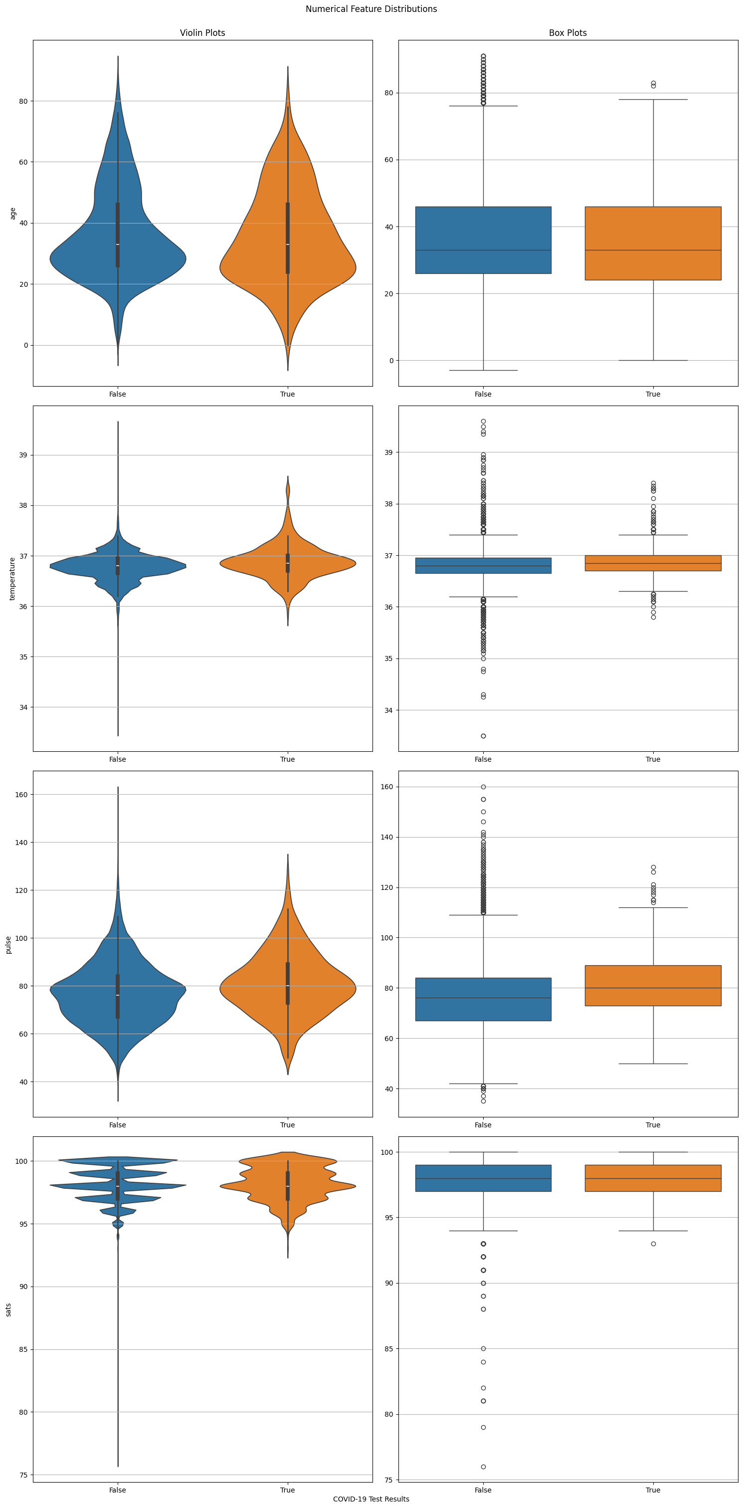
Note
Violin plots are essentially box plots combined with a kernel density estimation. While box plots give us a good understanding of the data’s quartiles and outliers, violin plots provide us with an informative representation of it’s entire distribution.
k-Nearest Neighbors (k-NN)#
k-NN is a simple and useful non-parametric method that is commonly used for both classification and regression. It relies on having some method of calculating distance between data points, and using the the “nearest” observations to predict the target value for new ones.

Loading the Dataset#
Basic Exploration#
import numpy as np

# Class colors
COLORS = "rgba(255, 0, 0, 0.3)", "rgba(0, 255, 0, 0.3)", "rgba(0, 0, 255, 0.3)"

# Create a unified dataframe.
data = pd.concat([X, y], axis="columns")


# Set class background color
def set_class_color(class_index: str) -> str:
    return f"background-color: {COLORS[class_index]};"


def set_class_name(class_index: str) -> str:
    return iris_dataset.target_names[class_index]


# Select some sample indices
sample_indices = np.linspace(0, len(data) - 5, 3, dtype=int)
sample_indices = [index for i in sample_indices for index in range(i, i + 5)]

# Display table
data.iloc[sample_indices, :].style.background_gradient().map(lambda x: set_class_color(x), subset=[TARGET_NAME]).format(
    {TARGET_NAME: set_class_name}).set_properties(**{
        "border": "1px solid black"
    }, subset=[TARGET_NAME]).set_properties(**{
        "text-align": "center"
    }).set_table_styles([
        dict(selector="th", props=[("font-size", "14px")]),
        dict(selector="td", props=[("font-size", "12px")]),
    ]).format("{:.2f}", subset=[col for col in data.columns if col != TARGET_NAME])
| sepal length (cm) | sepal width (cm) | petal length (cm) | petal width (cm) | class | |
|---|---|---|---|---|---|
| 0 | 5.10 | 3.50 | 1.40 | 0.20 | setosa |
| 1 | 4.90 | 3.00 | 1.40 | 0.20 | setosa |
| 2 | 4.70 | 3.20 | 1.30 | 0.20 | setosa |
| 3 | 4.60 | 3.10 | 1.50 | 0.20 | setosa |
| 4 | 5.00 | 3.60 | 1.40 | 0.20 | setosa |
| 72 | 6.30 | 2.50 | 4.90 | 1.50 | versicolor |
| 73 | 6.10 | 2.80 | 4.70 | 1.20 | versicolor |
| 74 | 6.40 | 2.90 | 4.30 | 1.30 | versicolor |
| 75 | 6.60 | 3.00 | 4.40 | 1.40 | versicolor |
| 76 | 6.80 | 2.80 | 4.80 | 1.40 | versicolor |
| 145 | 6.70 | 3.00 | 5.20 | 2.30 | virginica |
| 146 | 6.30 | 2.50 | 5.00 | 1.90 | virginica |
| 147 | 6.50 | 3.00 | 5.20 | 2.00 | virginica |
| 148 | 6.20 | 3.40 | 5.40 | 2.30 | virginica |
| 149 | 5.90 | 3.00 | 5.10 | 1.80 | virginica |
Train/Test Split#
A lot can be said regarding the different approaches for model validation and evaluation (which we’ll discuss later in the course), but the general guideline is that, since our model should detect underlying trends in the data, we would evaluate its performance over unseen data. Therefore, we’ll split our data into a training (for model fitting) and testing (for evaluation).
from sklearn.model_selection import train_test_split

X_train, X_test, y_train, y_test = train_test_split(X,
                                                    y,
                                                    random_state=0,
                                                    test_size=0.25)
We now have a training dataset consisting of 112 observations and a test dataset with 38 observations.
Model Creation#
Machine Learning algorithms and models are easily accesible through numberous packages, namely scikit-learn. While different estimators provide different advantages and pitfalls, they share some basic properties, making it easy for users to use them.
*Since these estimators are basically just algorithms and formulas that need to be tailored to the dataset being used, all estimators have a ‘fit’ method, (unsurprisingly) fitting the estimators to generalize to any specific data.
from sklearn.neighbors import KNeighborsClassifier

k = 1

knn = KNeighborsClassifier(n_neighbors=k)
_ = knn.fit(X_train, y_train)
Model Evaluation#
Misclassification Rate / Accuracy#

import numpy as np

y_predicted = knn.predict(X_test)

misclassification_rate = np.mean(y_predicted != y_test) * 100
Our model achieved a misclassification_rate of ‘2.632’%, meaning it correctly predicted np.int64(37) of 38 target values in our test set.
Another way to look at it is:
from sklearn.metrics import accuracy_score
accuracy_score(y_test, y_predicted) * 100
97.36842105263158
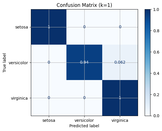
Confusion Matrix#
from sklearn.metrics import confusion_matrix
confusion_matrix(y_test, y_predicted)
array([[13,  0,  0],
       [ 0, 15,  1],
       [ 0,  0,  9]])
import matplotlib.pyplot as plt

from sklearn.metrics import ConfusionMatrixDisplay


disp = ConfusionMatrixDisplay.from_estimator(knn,
                             X_test,
                             y_test,
                             display_labels=iris_dataset.target_names,
                             cmap=plt.cm.Blues,
                             normalize="true")
_ = disp.ax_.set_title(f"Confusion Matrix (k={k})")
Linear Regression#
In statistics, linear regression is a linear approach to modeling the relationship between a scalar response (or dependent variable) and one or more explanatory variables (or independent variables). Wikipedia
Using linear regression with Python is as easy as running:
>>> from sklearn.linear_model import LinearRegression
>>> model = LinearRegression()
>>> model.fit(X_train, y_train)
>>> predictions = model.predict(X_test)
First, let’s reproduce scikit-learn’s Linear Regerssion Example using the prepackaged diabetes dataset.
Loading the dataset#
import pandas as pd

from sklearn import datasets

# Read the dataset as a pandas DataFrame
dataset = datasets.load_diabetes(as_frame=True)

# Create observations matrix and target vector
X, y = dataset.data, dataset.target

# Create a unified DataFrame containing both
data = pd.concat([X, y], axis=1)
Raw Inspection#
import numpy as np
import pandas as pd

# Select some sample indices
sample_indices = np.linspace(0, len(X) - 4, 4, dtype=int)
sample_indices = [index for i in sample_indices for index in range(i, i + 4)]

# Print data table (features and target)
data.iloc[sample_indices, :].style.set_properties(**{
    "text-align": "center",
}).set_properties(**{
    "border-left": "4px solid black"
}, subset=['target']).set_table_styles([
    dict(selector="th", props=[("font-size", "13px")]),
    dict(selector="td", props=[("font-size", "11px")]),
]).background_gradient().format("{:.3f}")
| age | sex | bmi | bp | s1 | s2 | s3 | s4 | s5 | s6 | target | |
|---|---|---|---|---|---|---|---|---|---|---|---|
| 0 | 0.038 | 0.051 | 0.062 | 0.022 | -0.044 | -0.035 | -0.043 | -0.003 | 0.020 | -0.018 | 151.000 |
| 1 | -0.002 | -0.045 | -0.051 | -0.026 | -0.008 | -0.019 | 0.074 | -0.039 | -0.068 | -0.092 | 75.000 |
| 2 | 0.085 | 0.051 | 0.044 | -0.006 | -0.046 | -0.034 | -0.032 | -0.003 | 0.003 | -0.026 | 141.000 |
| 3 | -0.089 | -0.045 | -0.012 | -0.037 | 0.012 | 0.025 | -0.036 | 0.034 | 0.023 | -0.009 | 206.000 |
| 146 | -0.031 | 0.051 | 0.060 | 0.001 | 0.012 | 0.032 | -0.043 | 0.034 | 0.015 | 0.007 | 178.000 |
| 147 | -0.056 | -0.045 | 0.093 | -0.019 | 0.015 | 0.023 | -0.029 | 0.025 | 0.026 | 0.040 | 128.000 |
| 148 | -0.060 | 0.051 | 0.015 | -0.019 | 0.037 | 0.048 | 0.019 | -0.003 | -0.031 | -0.001 | 96.000 |
| 149 | -0.049 | 0.051 | -0.005 | -0.047 | -0.021 | -0.020 | -0.069 | 0.071 | 0.061 | -0.038 | 126.000 |
| 292 | 0.009 | -0.045 | -0.022 | -0.032 | -0.050 | -0.069 | 0.078 | -0.071 | -0.063 | -0.038 | 84.000 |
| 293 | -0.071 | -0.045 | 0.093 | 0.013 | 0.020 | 0.043 | 0.001 | 0.000 | -0.055 | -0.001 | 200.000 |
| 294 | 0.024 | 0.051 | -0.031 | -0.006 | -0.017 | 0.018 | -0.032 | -0.003 | -0.074 | -0.034 | 55.000 |
| 295 | -0.053 | 0.051 | 0.039 | -0.040 | -0.006 | -0.013 | 0.012 | -0.039 | 0.016 | 0.003 | 85.000 |
| 438 | -0.006 | 0.051 | -0.016 | -0.068 | 0.049 | 0.079 | -0.029 | 0.034 | -0.018 | 0.044 | 104.000 |
| 439 | 0.042 | 0.051 | -0.016 | 0.017 | -0.037 | -0.014 | -0.025 | -0.011 | -0.047 | 0.015 | 132.000 |
| 440 | -0.045 | -0.045 | 0.039 | 0.001 | 0.016 | 0.015 | -0.029 | 0.027 | 0.045 | -0.026 | 220.000 |
| 441 | -0.045 | -0.045 | -0.073 | -0.081 | 0.084 | 0.028 | 0.174 | -0.039 | -0.004 | 0.003 | 57.000 |
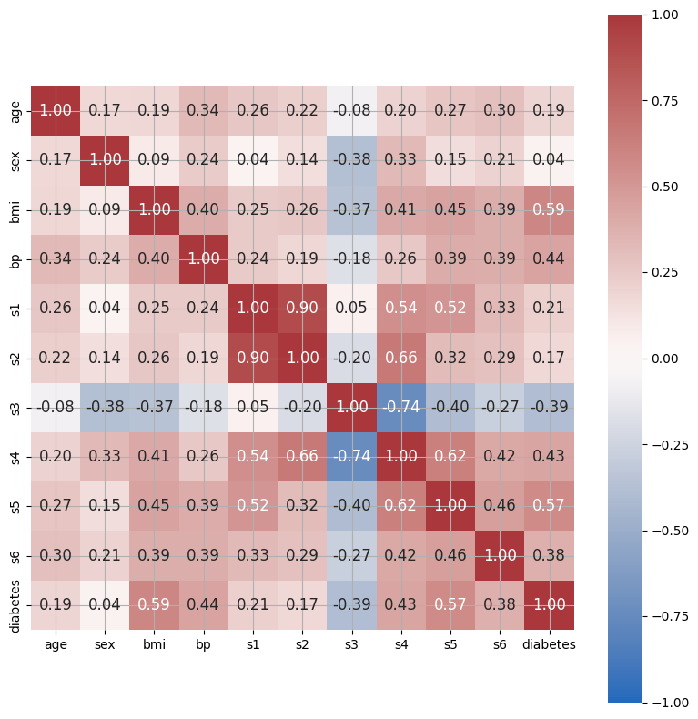
Feature Correlation#
We can use seaborn’s heatmap function to inspect feature correlations.
import seaborn as sns

# Calculate correlation matrix using NumPy
correlation_matrix = np.corrcoef(data.values.T)

# Plot correlation matrix using seaborn
fig, ax = plt.subplots(figsize=(8, 8))
tick_labels = list(X.columns) + ['diabetes']
hm = sns.heatmap(
    correlation_matrix,
    ax=ax,
    cbar=True,  # Show colorbar
    cmap="vlag",  # Specify colormap
    vmin=-1,  # Min. value for colormapping
    vmax=1,  # Max. value for colormapping
    annot=True,  # Show the value of each cell
    square=True,  # Square aspect ratio in cell sizing
    fmt='.2f',  # Float formatting
    annot_kws={'size':
               12},  # Font size of the values displayed within the cells
    xticklabels=tick_labels,  # x-axis labels
    yticklabels=tick_labels)  # y-axis labels
plt.tight_layout()
plt.show()
Simple Linear Regression#
Simple linear regression is a linear regression model with a single explanatory variable. bmi seems to show a discernible linear relationship with the target variable, so let’s go with that one.
from sklearn.model_selection import train_test_split

# Create a vector of the single predictor values
simple_X = X.bmi.to_numpy().reshape(len(X), 1)

# Split for simple linear regression
simple_X_train, simple_X_test, y_train, y_test = train_test_split(simple_X,
                                                                  y,
                                                                  random_state=0,
                                                                  test_size=0.2)
Model Creation#
from sklearn.linear_model import LinearRegression

model = LinearRegression()
_ = model.fit(simple_X_train, y_train)
Model Application#
simple_y_pred = model.predict(simple_X_test)
Model Evaluation#
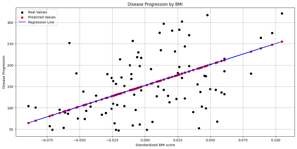
First, we’ll plot our predicted values alongside the observed values, as well as the regression line estimated by our model.
# Create figure
fig, ax = plt.subplots(figsize=(15, 7))

# Plot real values scatter plot
_ = plt.scatter(simple_X_test, y_test, color="black", label="Real Values")

# Plot predicted values scatter plot
_ = plt.scatter(simple_X_test,
                simple_y_pred,
                color="red",
                label="Predicted Values")

# Plot regression line
_ = plt.plot(simple_X_test,
             simple_y_pred,
             color="blue",
             label="Regression Line")

# Show legend
_ = plt.legend()

# Set title
title = "Disease Progression by BMI"
plt.title(title)

# Sex axis labels
ax.set_xlabel("Standardized BMI score")
_ = ax.set_ylabel("Disease Progression")
We can also use the sklearn.metrics module to calculate the MSE and coefficient of determination (\(R^2\)).
from sklearn.metrics import mean_squared_error, r2_score

mse = mean_squared_error(y_test, simple_y_pred)
r_squared = r2_score(y_train, model.predict(simple_X_train))
print(f"Coefficient: {model.coef_[0]:.2f}")
print(f"Intercept: {model.intercept_:.2f}")
print(f'Mean Squared Error: {mse:.2f}')
print(f'Coefficient of Determination: {r_squared:.2f}')
Coefficient: 981.66
Intercept: 152.29
Mean Squared Error: 4150.68
Coefficient of Determination: 0.38
Multiple Linear Regression#
General notation:

Calculating the coefficient vector of the least-squares hyperplane:

Multiple Linear Regression using sklearn#
Model Creation#
X_train, X_test, y_train, y_test = train_test_split(X,
                                                    y,
                                                    random_state=0,
                                                    test_size=0.2)

multiple_model = LinearRegression()
_ = multiple_model.fit(X_train, y_train)
Model Application#
y_pred_all = multiple_model.predict(X_test)
Model Evaluation#
mse_all = mean_squared_error(y_train, multiple_model.predict(X_train))
r2_score_all = r2_score(y_train, multiple_model.predict(X_train))
betas_all = [beta.round(2) for beta in multiple_model.coef_.flatten()]

print(f"Coefficient: {betas_all}")
print(f'Mean Squared Error: {mse_all:.2f}')
print(f'Coefficient of Determination: {r2_score_all:.2f}')
Coefficient: [np.float64(-35.55), np.float64(-243.17), np.float64(562.76), np.float64(305.46), np.float64(-662.7), np.float64(324.21), np.float64(24.75), np.float64(170.32), np.float64(731.64), np.float64(43.03)]
Mean Squared Error: 2734.75
Coefficient of Determination: 0.55